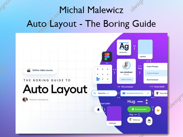
Auto Layout – The Boring Guide – Square Planet academy – Michal Malewicz
$49.00 Original price was: $49.00.$20.00Current price is: $20.00.
»Delivery: Within 7-14 days
 Auto Layout – The Boring Guide Information
Auto Layout is one of the most universally accepted design consistency methods out there.
Yet… most designers do it completely wrong!
I reviewed thousands of junior projects and noticed that many designs were very bad at the core. Auto Layout was applied – sure, but the design simply sucked. The automatic alignment didn’t help, and in reality it hindered the problem solving because it wasn’t applied …
… At the right time
I decided to change that and created a course about Layout and Auto Layout. It means I teach you what to do BEFORE applying Auto Layout so it doesn’t suck, and then how to apply it like we do when working for Banks, Med-Techs and other big brands with huge, complex projects.
Those skills of course also transfer to your portfolio building and startups!
What You’ll Learn In Auto Layout – The Boring Guide?
- How to use the Red Square Method like a pro
- Balance of optical design
- Blockframing, typeframing and hierarchy strips refresh
- Planning the Auto Layout for complex components
- How to do good Responsive Design
- When NOT to use Auto Layout
- Simple, most-common, reusable design components
- What are soft grids
- And how Auto Layout works in tools other than Figma (just in case)
- Plus all my unique techniques and methods…
More courses from the same author: Michal Malewicz
Salepage: Auto Layout – The Boring Guide – Square Planet academy – Michal Malewicz
Related products
»Pre-Order
»Pre-Order


