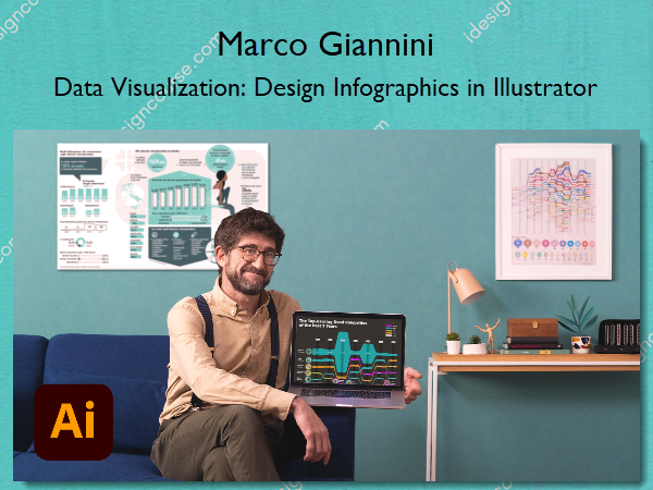
Data Visualization: Design Infographics in Illustrator – Marco Giannini
$19.99 Original price was: $19.99.$9.00Current price is: $9.00.
»Delivery: Within 24 hours
 Data Visualization: Design Infographics in Illustrator Information
Learn how to communicate complex information through meaningful data-driven images
Infographics are an important tool for helping people to understand the world, inspire deeper thinking, and even take action. Marco Giannini has worked as a data journalist and information designer for over 20 years, exploring ways to connect data with images to make clear, memorable, and dynamic designs. He’s the founder of creative studio, Dataspoiler, and has worked with organizations including the IUCN and WWF.
In this course, he teaches you how to make infographics in Adobe Illustrator as you dive into the different types of infographics and their potential. Learn how to examine and organize data, explore design possibilities, and see how to apply what you learn to future projects. See how to translate data and numbers into meaningful and engaging images.
What You’ll Learn In Data Visualization: Design Infographics in Illustrator?
- Introduction
- About Me
- Influences
- Understanding Infographics
- The Basic Structure of a Layout
- The World of Informational Graphics
- The Language of Visualization
- Elements of Visualization
- Adapting to the Audience
- The Data and the Design
- Data Analysis and Spreadsheets
- Sketching Out Our Creativity
- Designing in Illustrator 1
- Designing in Illustrator 2
- Fine-Tuning the Graphic 1
- Fine-Tuning the Graphic 2
- Final Touches 1
- Final Touches 2
- Further Arguments on Infographics
- Potential Design Variations
- The Choice of the Style
- The Choice of the Content
- Visual Encoding vs. Fixed Chart Types
- Exporting the Infographic
- Final project
- Data Visualization: Design Infographics in Illustrator
More courses from the same author: Marco Giannini
Salepage: Data Visualization: Design Infographics in Illustrator – Marco Giannini
Related products
»Pre-Order
»Pre-Order
»Pre-Order
»Pre-Order


